Walking down memory lane I’m amazed how little actually changed in the realm of fonts.
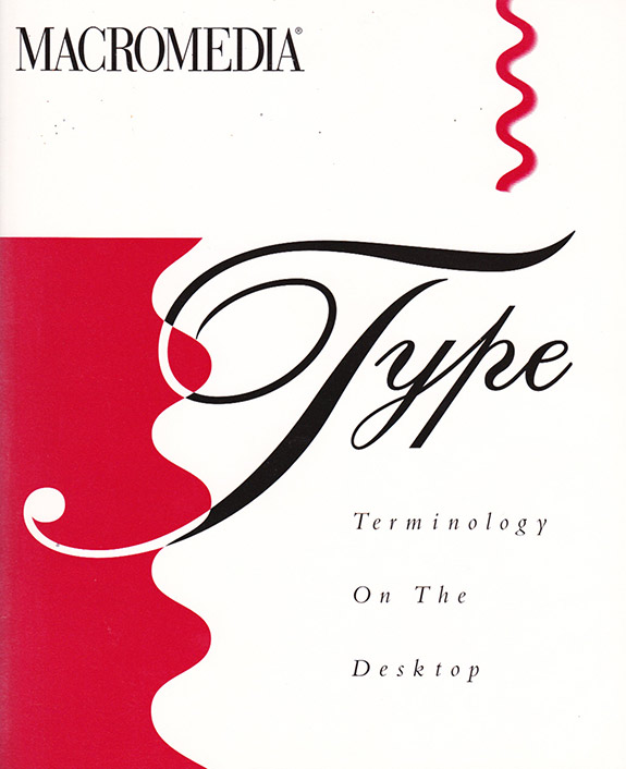
Why am I writing this? I just happen to come across a booklet called “Type Terminology on the Desktop” from Macromedia, Altsys, published 1991! I love to peruse old software manuals from programs long gone. Some of them used to be the “big boys” and dominated the market, like FreeHand.
No matter the software there are a few ground rules regarding fonts. Terminology like kerning, mean line, metrics and vertex are still used today. It is still an art to create an appealing font. What has changed however is the type of font in vogue today. Taste is influenced by the web and we see a mutation between the print and browser world. This trend is also driven by Google's introduction of online fonts. No longer are we forced to look at Arial or Times Roman only. Roboto, Lato and Lobster are just a few of the many available.
Here are some tips:
- Try to use no more than two font types in your document, whether print or online
- Rather use bold than underlined, and never both together
- Pick the right font to give the appropriate “feel”. You wouldn't use Comic (a font type name) for a business letter, wouldn't you?
- To stay with today's current trends head over to http://www.google.com/fonts
- Don't neglect your business cards with mediocre fonts
The booklet as a PDF. Copyright Altsys Corporation. A defunct company since 1995. Read more about Altsys.
Below the cover of the booklet that caused me to write about fonts:
A few font influencers: Altsys, Macromedia, Adobe and Apple
Look professional and use a highly rated online printing service